So You Want To Be A Pixel Artist?
My name is Tsugumo, and this is what I know.
Chapter 13: Let There Be Light
A brief update: Chapter 12 marks the start of a new set of tutorials, 4 years after Chapter 11 was completed. I've learned a lot since the old chapters, and I now know the answers to questions I had back then...as well, some of the information from older chapters is not necessarily "wrong", but not the way I understand or do things now. The previous chapters are still solid resources, but in the new chapters I'll be correcting some of the things I feel need changing. Keep in mind though, that the best thing you can do to get a solid understanding of pixel art is to read all the chapters, from the first through to the last instead of just skimming through little bits that seem interesting at a glance. I tend to go off on tangents and get sidetracked easily because I have a lot to explain, so a chapter will often cover more than what its title describes. Now then, let's begin...
Reading back over Chapter 11, I notice that I say to imagine a light source in front of the character and go from that. It was so long ago that I learned the actual light source position to use that it's actually hard for me to comprehend that I once didn't know it, heh...I'm pretty sure someone on a message board filled me in on this, as just a casual off-hand comment, but like many things in pixel art, the simplicity of the answer and how logical it was, threw me for a loop. Videogames use a ton of sprite flipping...why make two run cycles (one facing right and one facing left) for a character, taking up time, energy, and memory/cartridge space, when you can just draw the character running to, say, the right, and flip them to face the left via the game's engine. The problem with sprite flipping is that you end up with characters holding swords in their right hand, then they're flipped, and suddenly they're holding the weapon in their left hand. As odd and obvious as that sounds, most people don't even notice it. People let a LOT of things go in a game (like a character's foot standing off the edge of a platform while the character is still somehow balanced fine on top...or a character instantly rising when the jump button is pressed, instead of having a massive wind-up, which would make the controls less responsive).
However, just because people tend to let things slide, you still want to avoid visual "glitches" where you can...last thing you want is the player focusing on spotting mistakes instead of enjoying your game. The way to do this when it comes to lighting is simple...the light source should be directly above the character. Imagine someone standing directly under a spotlight. If you base your shading around that idea, whether the sprite is flipped left or right, the lighting will look consistent. Let's take a look at a quick example:
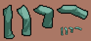
With the light source directly above the character, we're going to break this down into 3 colors. We'll have dark green, medium green, and light green. The first leg is directly down beneath the character. Because it's not going to catch any of the bright spotlight (the torso is above the leg and blocking the light from reaching it), it's only going to use medium green and dark green. The thigh is going to be round, so the front is going to bulge out a bit, which means the front is going to catch more light than the back (picture a generic gradient shaded 3d sphere...the edges are darker than the middle). Now the knee sticks out a bit and the shin goes inwards slightly, which is going to create a shadow underneath the knee, until the bottom, where the pants flare out a bit and catch light again. The tricky part to shading clothes is understanding the anatomy underneath them...but no matter whether you're doing clothes, bare skin, fur, or anything else, the lighting concept is the same.
Now the second leg starts to bend up...the thigh becomes a bit more horizontal, and thus it begins catching the bright spotlight, so we use light green on it. The bottom half of the leg is still vertical, so it's still shrouded in darkness like before. The third leg is bend even more, and now because the thigh is still round, the bottom of it starts catching the dark green shadow. The second leg's thigh was still primarily vertical, so it only picked up a few dark green pixels. If you look for a pattern, you'll notice that basically the more horizontal the thigh is angled, the more dark green pixels it gains. Again, the shin is still in darkness. Lastly, the fourth leg is totally horizontal and the shin is straightened out a bit. Before this position, the dark green pixels on the thigh were always separated from the light green pixels by the medium green pixels. But once the extreme horizontal position is hit, you get places where the dark green is touching the light green and the medium green becomes minimal. The shin on the fourth leg also catches light because there's nothing above it to block it, so like the thigh, it gets a bright light green spot and goes all the way to dark green.

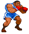
Try thinking of it as if the object you're shading is attatched to a wheel...at it's lowest, and most vertical state, it's covered in shadow. As it rises, the medium shade begins catching light shade, but still separates the light and dark shades from eachother. But, as the object is rotated further upward, that medium shade buffer gets thinner and thinner until it's all but gone. As the object continues further upward, the dark shade overwhelms the others, and the medium and light shades both start to vanish. Once the object is upwards, it's back to basically the dark and medium shades, like when it was downwards. Because we're putting the light source directly above, but also slightly in front of the object, there's still a bit of light catching on that upward object. If the light source were truly directly overhead, the upward peg would be just the dark shade, with no medium or light shade on it at all...that doesn't make for an interesting visual though, in terms of showing off your characters (a round leg would suddenly look flat), so that's why we keep the light source a little in front. Using this concept, check out Kim's sprites from Capcom VS SNK, which have some of the best and most obvious lighting going on:
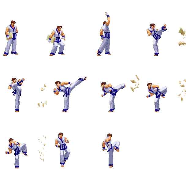
Now look for the lighting concepts I just explained...specifically, focus on his foreground leg (the non-kicking one). In the first 4 frames you can see the thigh jump from medium to light, depending on how it's bent. In frames 5 - 8, watch that leg and you can see it starts out as dark and medium, then the thigh becomes lighter (they use more shades than my example did, so there are in-between shades) while the shin stays medium...In frame 7 the thigh gets bright, but it's still got some slight shade on it's top (that dark to light buffer that gets thinner and thinner), while the shin remains medium but has picked up slightly more and more dark with each frame. Then finally in frame 8, the thigh is only bright, and the shin drops to dark, and the contrast between the two is at its highest. In the last 3 frames of the sheet, the knee rotates forward, keeping that ultra bright/dark contrast while it's bent, but as it straightens, the medium shade begins emerging and we go back to the bottom of the wheel. In the very last frame, his leg is realistically directly vertical underneath him, catching no shading, which is an example of how it can look flat if you have no other shades in there...you can get away with it here and there, but you generally don't want to have an entire leg constantly flat-shaded like that (unless it happens to be a part of the style...Capcom tends to do this in Darkstalkers, but they do it consistently throughout all the animations, which makes it their "style" for the game). Let's look at some more Capcom VS SNK sprites:
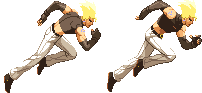
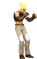
In the first frame, Benimaru's back is swamped with light shade, as if a giant intense spotlight were aimed down on him. His foreground leg is catching intense light all the way down, and his background leg is shrouded in dark. Then in the second frame, when his body is rotated the other way, his chest is entirely dark with just a little bit of light catching on his back. Now the background leg catches some of the intense light because there's nothing above it, except his butt still casts a shadow down the background leg's thigh. His foreground leg's thigh is catching light, but the shin is blocked by the thigh so it gets dark shades.
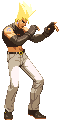
Now here's a great example of picking a style even after you've chosen a light source...We have Benimaru from Capcom VS SNK, and Balrog from Street Fighter Alpha 3. Now in Alpha, Capcom decided that while they have a vertical light source, the background limbs will generally follow the rule that it's darker than the foreground limb. So while Balrog's thighs are both bent at the same angle and catching the same light, the background leg catches darker shades than the foreground leg. The arms follow the same thing. The idea behind this is that it adds a little more of a 3d feel to the characters, because the darker limbs seem to go more into the distance (the less shades you use, the flatter something looks, like in the Kim example where his leg is shaded with just one color). It also helps keep the two limbs looking different throughout an animation...if a light limb crosses in front of a dark limb, your eye can still easily follow which is which. If both limbs are the same shade, they can blend together and be momentarily visually confusing (which is bad, it takes the viewer out of the animation because their brain is suddenly going "Wait, did the left leg kick or did it stop suddenly and the right leg kicked?"). Yet with Capcom VS SNK, Capcom decided to follow consistent lighting in that both Benimaru's front and back legs catch that spotlight with the same intensity. Again, they keep these "rules" consistent throughout all the art in the games, which makes it a conscious choice, and thus, a "style" rather than a mistake. Which style looks better? That comes down to opinion, heh. Other things to note in Benimaru's stance are how his lower torso and crotch are shaded, almost flat, and how his foreground arm, while it catches the SAME light as the background arm, catches MORE of that same light, which helps to separate it from the other arm the way Balrog's arms are separated by catching the same amounts of DIFFERENT lights. Still with me?
Last Benimaru example is his walk cycle...check out the light shade on his thighs as his legs move. Everything else stays pretty much the same, but those lights change and shift depending on the angle of his thigh how much of the thigh is covered by his upper body. Lighting is a tricky concept to get at first, but the principles are the same for lighting in pixel art as they are for lighting in a sketch or painting. Study the generic art class examples of the shaded apple/sphere and throwing a blanket in a clump on a chair and analyzing the way the shadows on it work...which ones are gradual changes from light to dark, and which are sharp. In fact, here's a quick example of just that:
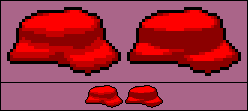
The object on the left looks more curvy and jelly-like...basically the curves on it are big and gradual, so you see a lot of medium shade between the light and dark shades. The object on the right looks more sharp-edged and rock-like...the "curves" are pretty much 90 degree edges, so the medium shade is almost non-existant. This simple little rule can help you dramatically when you're lighting your characters...A leg with only a slight bend at the knee is more like the first object, with a big and gradual curve, meaning you'll see more medium shade...whereas a leg bent 90 degrees has a sharp edge at the knee, which'll often result in light shade jumping right into dark shade. To truly become a solid pixel artist, study the principles of art in general, and figure out how to apply them specifically to pixel art...because at the end of the day it all flows from the same logic.
Back to main...